SUMMARY

From the standpoint of revenue and traffic, Checks Unlimited is the flagship of Direct Checks' 11 brands of direct-to-consumer check businesses which all fall under the banner of the Deluxe Corporation.

The company recognized that their web and mobile experiences had certain usability issues and they needed much more than just a facelift. While they had never previously employed a User Experience Designer, the company saw the value in having someone dedicated to their users and to the implementation of a user-centered design process. My goal was to rethink these experiences to solve our users' problems and help drive revenue for their brands.
CHALLENGES
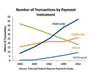
By far the greatest challenge to this business is the continued viability of the paper check as a payment system. In my initial research, I wasn't surprised to learn that the usage of checks has plummeted in the United States. According to the Federal Reserve's Cash Products Office, check usage has declined 50% from 40 billion transactions in 2000 to 20 billion transactions in 2012. Obviously this dramatic change in users' payment preferences is due to the rise of alternative payment systems such as: online and mobile banking, debit and credit cards, and peer to peer payment applications like PayPal and Venmo. All of which begs the question: How long will this business last?
USER RESEARCH
70% of users are members of the Baby Boom & World War II generations.
69% identified as female.
76% continue to purchase checks from the same company as their previous order.
Accuracy of the information printed on the check is the single most important aspect of a successful check purchase.
In general, senior users are more likely to have issues or problems related to: vision, dexterity, hearing, memory, information processing, and decision making.
Given the physical and cognitive issues that arise with advancing age, and in comparison to younger users, senior users on the web:
Become fatigued and discouraged more easily
Are slower and more methodical
Give up more often
Are more hesitant to explore or try new things
Are less likely to look for or ask for help when struggling
Are more likely to blame themselves instead of the design
Understanding that market research isn't user research, I did gather
some basic demographic intelligence, uncovered a few useful behaviors, and achieved a better understanding of the business by reviewing the recent U.S. Personal Check Purchase Market Survey which was prepared for the company by an outside marketing consultancy firm.
I was able to validate the older and female demographic as well as the higher rate of re-orders by auditing numerous telephone orders for personal checks at the company's call center. It was striking to witness the volume of users that still use the telephone to order the things they need and validated my research findings that older users' preferred method of communication when they need help is over the phone.
Amy Schade's article, Designing for Five Types of E-Commerce Shoppers, was extremely helpful in identifying the motivations and the needs of the specific types of e-commerce shoppers. Armed with this information, I was able to help define and focus our users into two specific types of shoppers: the product focused shopper and the bargain hunter. Knowledge of their specific habits and motivations was also instrumental in the development of personas and scenarios.
The product-focused shopper type has real application to our users because personal checks can be one of those annoying expendable products that people are always running out of like the 'classics' such as milk and toilet paper. Thus product focused shoppers are replacing an item they already have, know exactly what they want, need to locate it quickly, and buy it. They are coming to our site with a real sense of purpose and aren't there to browse or conduct research.
A substantial portion of our users are bargain hunters motivated by finding the best deal on personal checks and getting that good deal trumps any measure of brand loyalty. These users need to locate deals quickly, have discounted or sales prices aligned next to full price items, and the savings must be clearly highlighted in order to entice them into a purchase.
I took a deep dive with my research of senior users with Nielsen Norman Group's Senior Citizens on the Web (2nd Edition). This evidence-based research report and its design guidelines proved to be an invaluable resource for developing a deeper understanding and sensitivity to the specific behaviors, needs, and challenges of this rapidly growing group of users.
One of the most important outcomes of my user research was the realization that just one component of your users, in this case, it was their age, can have an enormous impact on the success or failure of their experience with your design and validates the critical role that thorough user research plays in the design process.
DISCOVERING A MAJOR PAIN POINT
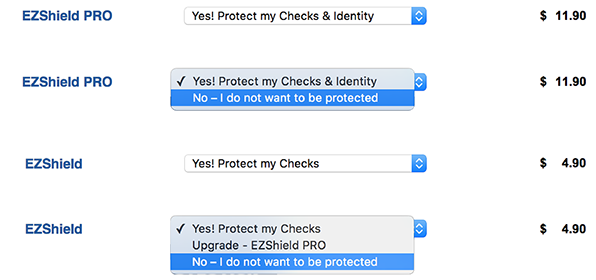
I'd never encountered such behavior from a drop-down menu before. Obviously it was very confusing for our users and was perceived by many as a deceptive 'upsell' that was damaging the credibility of the brand.
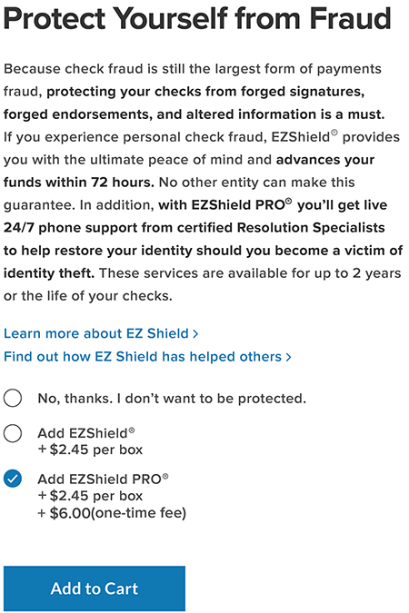
I researched the reviews and complaints about the company online at the Better Business Bureau to uncover any problems with the current website experience. What echoed throughout the reviews was that many users were particularly upset by the current practice of assumptively adding a third-party's check fraud protection to their check orders in the shopping cart.
Although users can eliminate the item from their shopping carts what really made the experience so frustrating was that they must select 'No - I do not want to be protected', not once, but twice!
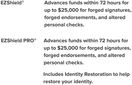
As you can see below, when a user selects 'No - I do not want to be protected', rather than eliminating the item from their shopping cart, its selection actually defaults from EZShield Pro to the less expensive EZShield and the resultant message in the drop-down menu is now 'Yes! Protect my checks'. This poorly designed drop down menu defies its own logic. Shouldn't 'No - I do not want to be protected' mean just that?
DESIGN SOLUTION
In rethinking the design for the EZShield protection plan offerings, I advocated for it's own dedicated page within the user flow à la Apple's AppleCare protection plan to:
highlight the values and benefits they provide to customers.
better communicate and clarify the different service protection plans and pricing.
eliminate the poorly designed drop-down menus in favor of simple radio buttons.
create transparency to invite and restore the trust of our users.
There's an art to writing effective 'copy that converts' and it's always a challenge to distill content down to the most important aspects for your users. While this was perhaps best left in the more capable hands of a professional copywriter, this dedicated page greatly improved our users' experience with the fraud protection plan offerings from EZShield.
PERSONAS & SCENARIOS

In our research, teams that utilize robust personas find they create better designs, especially for things they wouldn’t normally use themselves.
- Jared Spool
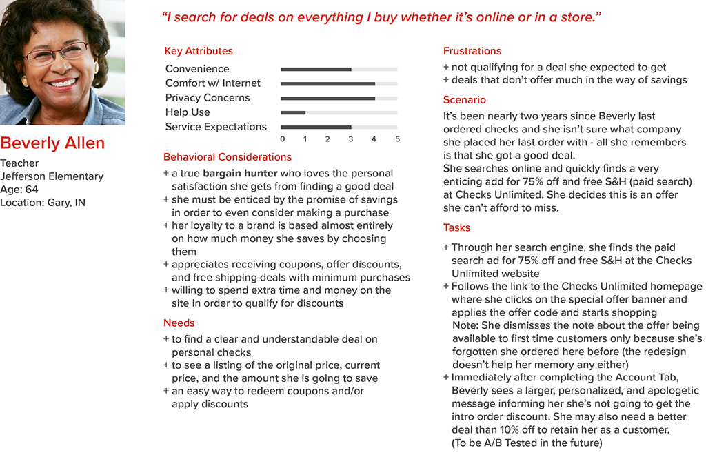
I created and presented a number of personas and scenarios to the product team to: summarize my user research, remind everyone who are users are (real people), and to focus my design efforts on solving our users' specific problems.
These personas and scenarios included:
a first-time customer without an offer code
a first-time customer with an offer code
a re-order customer with an offer code
a re-order customer who mistakenly believes she's a first-time customer who qualifies for lower introductory offer pricing
As you can see, I created specific users and scenarios that reflect the real-world experiences of our users.
In the case of the last scenario, it is encountered quite often by some of our users and was an ongoing issue that we wanted to address. Contributing factors that created this scenario and made it tricky to solve are the facts that:
our customers are older and it's very likely they may have forgotten which brand of checks they purchased the last time they ordered checks.
our average customer placed their last check order 18 months ago which compounds the forgetfulness factor.
To lessen the blow to these users' expectation of a bargain on their checks, the only viable solution to the problem was to construct a more sympathetic message than was currently communicated and it was suggested to offer a better than 10% savings on their order as well.
"FIRST-TIME CUSTOMER" (actually a re-order customer)
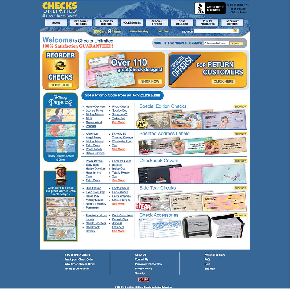
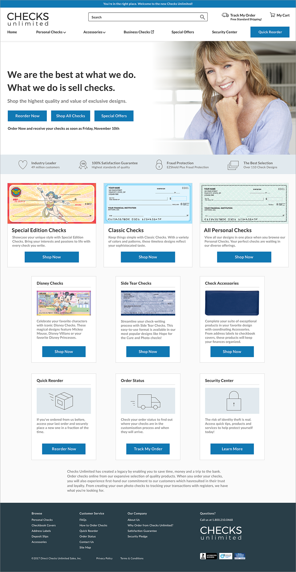
HOME PAGE
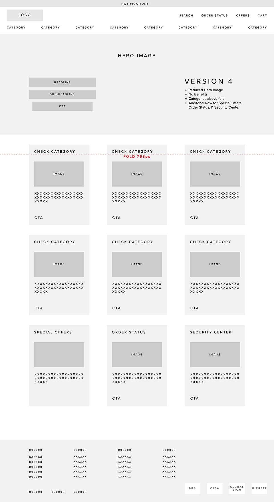
As was expected for such an important piece of real estate, no other page amassed as much discussion, iteration, and revision than the Home page. Everyone, it seemed, from site optimization, marketing, licensing, creative, SEO, and even our Senior Vice President, weighed in on the design which made for a lot of 'cooks in the kitchen.'
Despite the challenge of balancing all these opinions and priorities, at the end of the day, the Home page was greatly improved in terms of:
conveying the 'Big Picture'
giving users clear places to start
making use of a standardized design pattern
eliminating clutter and reducing visual noise
breaking the page into clearly defined areas
improving credibility and trust
If you've read it - shame on you if you haven't - it's pretty obvious I took more than a few ideas and therefore owe a great deal of gratitude to Steve Krug's Don't Make Me Think for the enormous help it provided in the redesign of the Home page.
BEFORE & AFTER
SETTING EXPECTATIONS
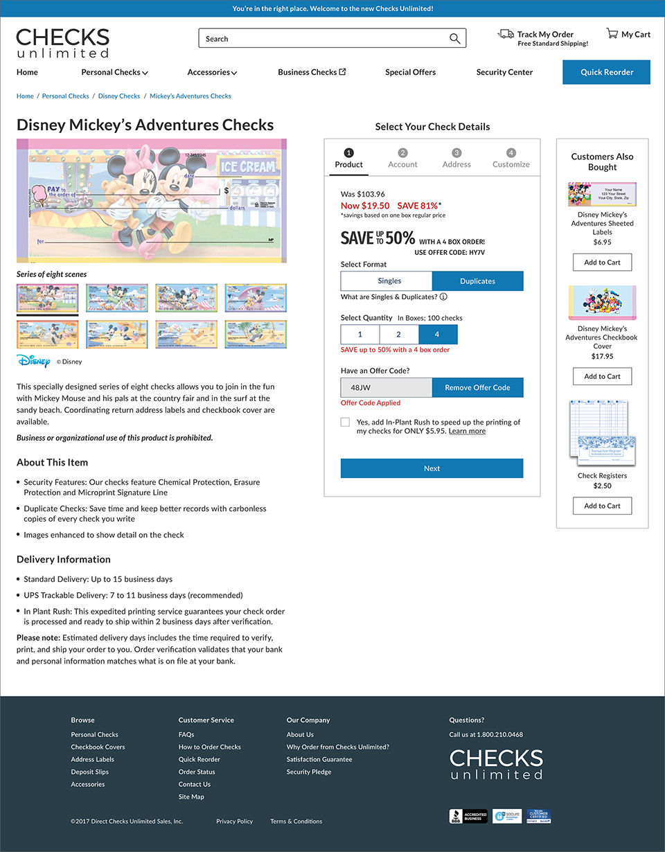
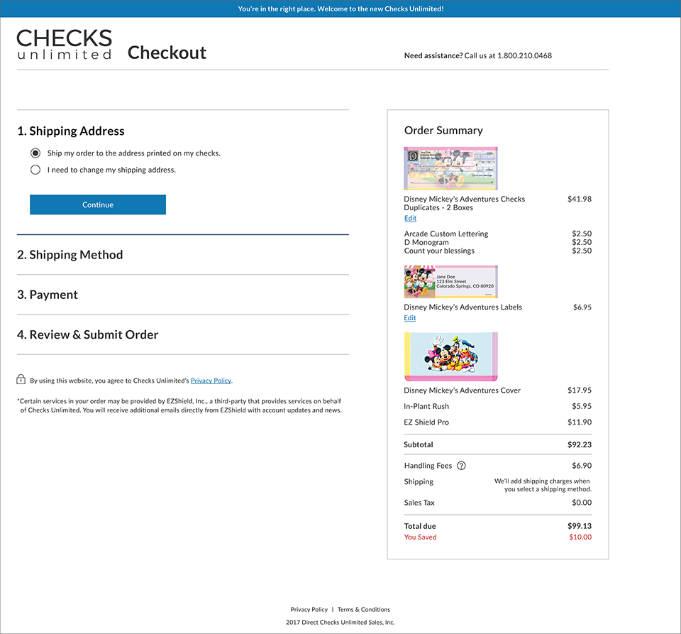
In taking a holistic approach to the design of the user flow, I saw an opportunity to help set our users' expectations of the time and effort required to complete their tasks by distilling individual pages of the existing design into numbered and labeled tabs on the product detail page. A tab provides the affordance for displaying grouped content as well as a means to easily switch between different groups of content. I felt this was essential to the design given the worrisome behaviors of senior users discussed previously and due to the amount of information we require from them. Specifically, it's the numbering of the groups that helps provide a contextual order to the flow of the required steps to complete our users' tasks and was unanimously understood in my user testing of the same. The tab section also made a great deal of sense for a responsive web design in consideration of the mobile experience as well.
Likewise, the same considerations were applied to the design and behavior of the checkout procedure. Given the pervasiveness of the accordion style checkout in web design, and more importantly, the high likelihood of some degree of familiarity and success with it, it proved itself a wise choice for our users.
PROTOTYPING & LEARNING TO LOVE AXURE RP

I knew we were going to be asking users, especially new users, to work with forms to complete the task of placing a new check order. So it only made sense to build a prototype capable of creating and handling an interactive form. A tool like InVision just doesn't have such capability. All of which suggested I give Axure RP another try.
I won't bore you with a long story of my previous experience building a basic prototype in Axure. Let's just say I didn't enjoy it. Like really didn't enjoy it.
In trying Axure again, and for whatever the reasons may be, everything suddenly fell into place. It was exciting and actually quite fun to see static mockup pages blossom into a functional design, albeit a prototype. Working in Axure was instrumental in allowing me the opportunity to create and test some critical interactions such as applying and removing offer codes, additional product views, and most of all, error messaging. Given that older users are so prone to making typographical errors, I was really pleased to be able to test our users' ability to correct their mistakes.
USER TESTING
A total of 11 one-hour usability tests were conducted with the Axure prototype for the proposed redesign of the Checks Unlimited website.
Seven usability tests were conducted with current call center employees of Direct Checks as was the previous practice of the company when conducting any usability testing.
Recognizing that testing with employees is never ideal as there's bound to be instances of favorable bias, I conducted four additional usability tests with test takers who were not employees of Direct Checks nor had any prior experience working in the check sales industry.
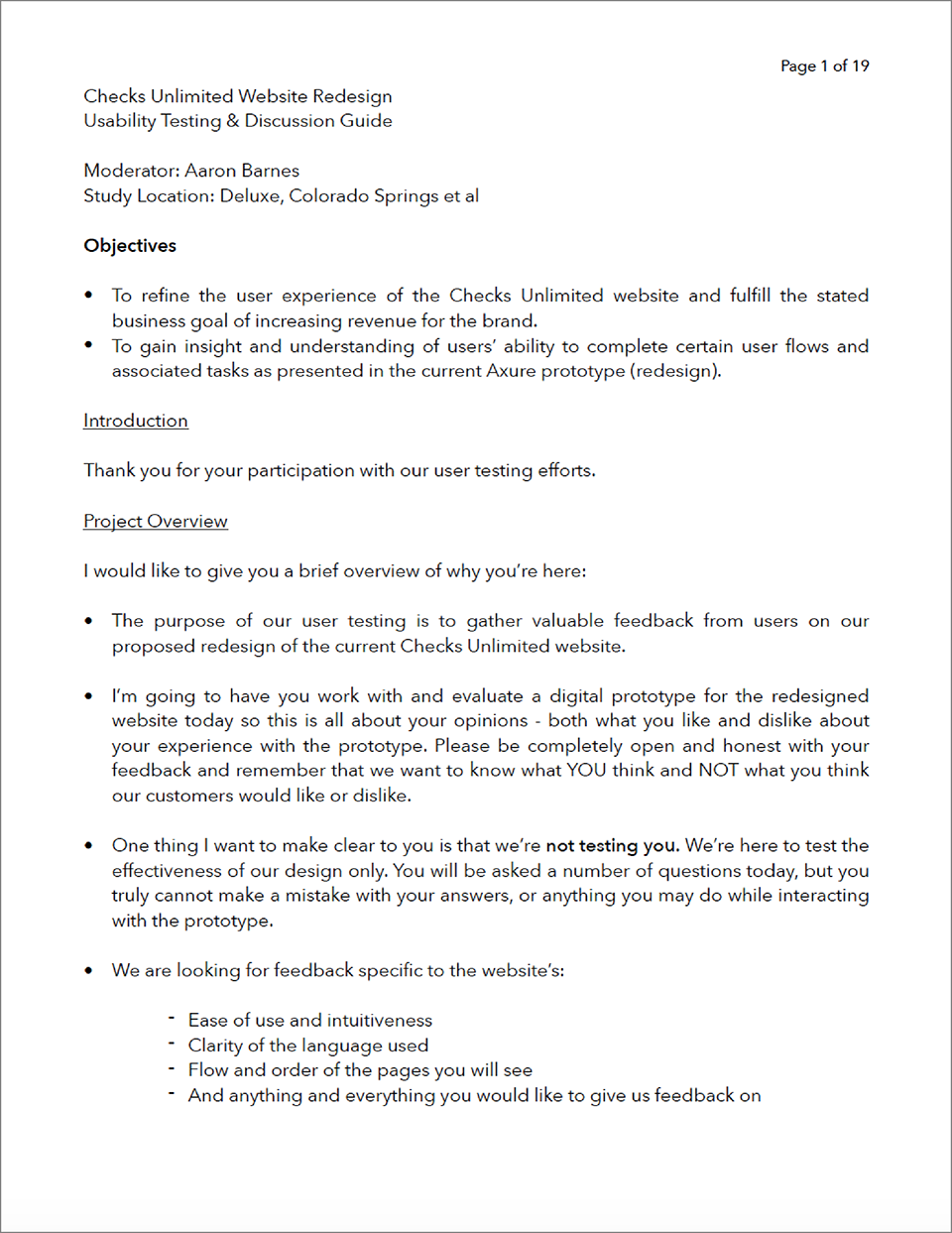
In preparation for user testing, I created a testing and discussion guide to assist me with communicating the testing procedure to users, critical interactions with the prototype that I wanted to test and observe, specific questions I wanted to ask, as well as ample space to record all of my notes.
Throughout the tests, users were encouraged to use a 'think aloud' testing protocol as they were observed working their way through the necessary steps to complete the task of ordering personal checks. These steps included:
finding and selecting a check product
completing the required banking and personal information
completing check customization features
reviewing the product for accuracy
reviewing and editing items in the shopping cart
completing the checkout procedure
order confirmation
If time allowed during the tests, as was the case in nearly all of the tests, users were also asked to complete both the Quick Reorder and Order Tracking user flows.
Overall, my observations of our users and their comments on the ease of use, intuitiveness, clarity of language used, and the order and flow of the steps necessary to complete these tasks were very positive.
I asked users to rate their experience using the prototype on 1 to 7 scale, with 1 indicating 'very difficult' and 7 indicating 'very easy'. The average overall rating was 6.5 and the lowest rating given was a 5.
FINAL RESULTS
As of this writing, the redesigned Checks Unlimited website has yet to launch. However, the redesign of the Checks.com website which incorporated the same design solutions as Checks Unlimited was released on July 23, 2017. Some of the positive highlights from that redesign effort include:
a 3.33% increase in conversion for the period ending December 31, 2017
the average time taken for users to complete the entire order process decreased by 23 seconds
individual page metrics indicate the rate of abandonment for the shopping cart and payment method decreased by -1.97% and -9.46% (respectively)
REFERENCES & DOCUMENTATION
Phillips, Matt. “The Spectacular Decline of Checks.” The Atlantic, Atlantic Media Company, 5 June 2014. Web. 7 Oct. 2016.
"U.S. Personal Check Purchase Market Survey." KeyStat Marketing, Inc., 31 Jan. 2017.
Pernice, Kara. Estes, Janelle. Nielsen, Jakob. "Senior Citizens (Ages 65 and Older) on the Web." 2nd Edition. Nielson Norman Group, Nielsen Norman Group. Web. 23 Mar. 2017.
Schade, Amy. "Designing for Five Types of E-Commerce Shoppers." Nielsen Norman Group. Nielsen Norman Group, 2 Mar. 2014. Web. 15 Mar. 2017.
Krug, Steve. “Don't Make Me Think, Revisited: A Common Sense Approach to Web Usability” (3rd Edition). New Riders. 2014.
One of many wireframe iterations for the Home page.
A screenshot from my user testing and discussion guide.
WEAPONS OF CHOICE

