SUMMARY

One of the primary business goals of the LACMA online store is to support the museum with additional revenue. However, there were some serious usability challenges that were preventing users from finding merchandise and completing online transactions. A thoughtful and thorough redesign of this e-commerce site was necessary to enhance usability and to service the business goal of increasing online sales revenue.
CONSIDERATIONS
How can I design the user flow in a logical, intuitive way that allows users to effectively navigate to merchandise items in just three clicks?
What checkout process would best serve the user focus of finalizing the transaction efficiently, yet still accommodate for an error, namely the dreaded forgotten password?
CHALLENGES
Given the scope of this project, the greatest challenge proved to be researching, designing, and delivering a high-fidelity and tested prototype within just two weeks' time.
PROCESS & SOLUTIONS
.jpg?crc=4294224558)
Rather than diving into research, I decided to begin my process as a user to get a general feel for the site's design, its products, audience, and, most of all, its usability.
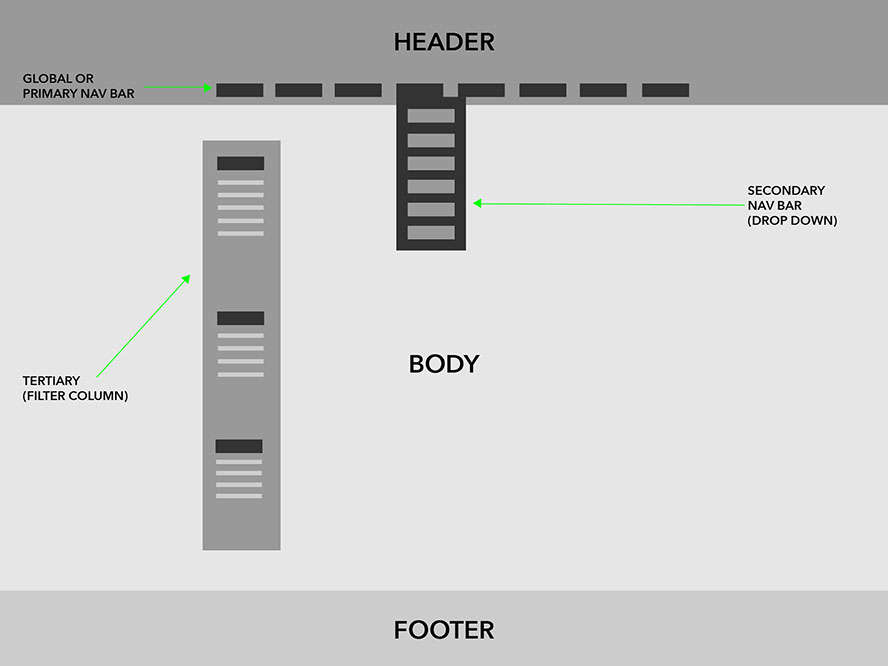
Most problematic was the taxonomy, or the classification of the merchandise which, in turn, had a great effect on navigation efficiency. I quickly came to the conclusion that that the site would benefit by a redesign of these elements. A 'tweak', here and there, was not going to solve the problem.
Creating an order from chaos
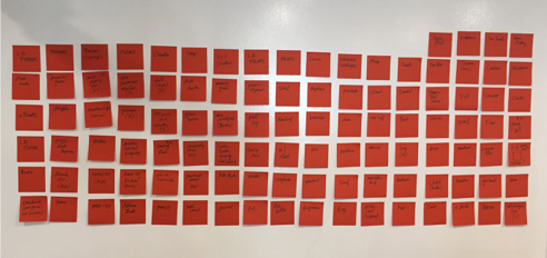
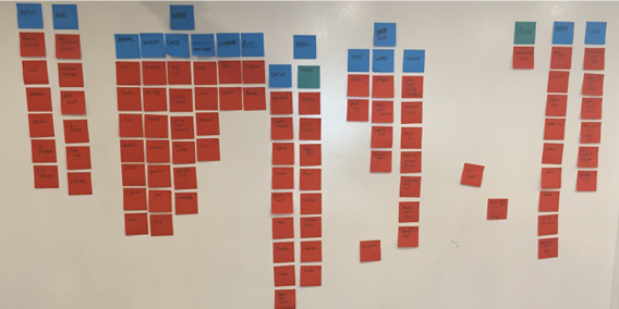
After taking a complete inventory, and beginning to find affinities between the items, it was common verbs, rather than nouns, which seemed to provide the best solution. This solution was also efficient in that it helped trim the number of categories to eight within the navigation bar.
USER RESEARCH
Discovering our users
According to the Reach Advisors' article Who's Coming To Your Museum, regular visitors to art museums are "generally, an older visitor base, with 65% of respondents over age 50, and have the highest college attainment of any type, with 86% having at least a college degree." 92% of the respondents identified as white.
In their 2008 Survey of Public Participation in the Arts, the NEA reported similar findings with the demographic distribution of visitors to art museums at nearly 80% white.
USER PERSONA

Based upon my user research, a persona began to emerge and a narrative was created.
Name: Henry David
Age: 72
Sex: Male
Race: White, Non-Hispanic
Status: Married
Occupation: Retired (physician)
Family: 2 grown children, 5 grandchildren
Favorite TV: House of Cards, Mornings with Maria
Favorite Music: Classical
Interests: Art, Symphony, Travel, Investing
Touch Points: LACMA (basic membership), Internet, iPhone, iPad, DirecTV. Only gets apps that friends and family tell him he has to get.
Pain Points: “Senior Moments” which he ascribes to a fading memory. Henry has to write down his passwords and squirrel them away in his desk. Hates things that don’t work as they should. Feels he is “somewhat tech savvy” but sometimes has trouble with technology and has to call his kids for help. Driving. Traffic.
Needs: Simplicity. Simplicity. Simplicity.
USER SCENARIO
Henry recently visited the LACMA gift shop with his wife and saw she liked a particular necklace in the display case. Her birthday is in two weeks and he would like to purchase it for her. He’s unsure of some of the specifics about the necklace but he will “know it when he sees it”.
COMPARATIVE/COMPETITIVE ANALYSIS
In my appraisal of comparative and competitive examples, I decided to take a 'hybrid' approach to the redesign of the LACMA store. I was inspired by the simplicity and elegance of the layout of The Glass House, and coupled that with the very user-friendly checkout procedure of Apple's online store.
ART MUSEUMS
MoCA Chicago
MoMA New York
Walker Art Center Minneapolis
Neue Galerie New York
The Glass House New Canaan
E-COMMERCE
Apple
Nordstrom
A
mcachicagostore.org
momastore.org
shop.walkerart.org
shop.neuegalerie.org
designstore.theglasshouse.org
E-COMMERCE
store.apple.com
shop.nordstrom.com
FINISHED PRODUCT
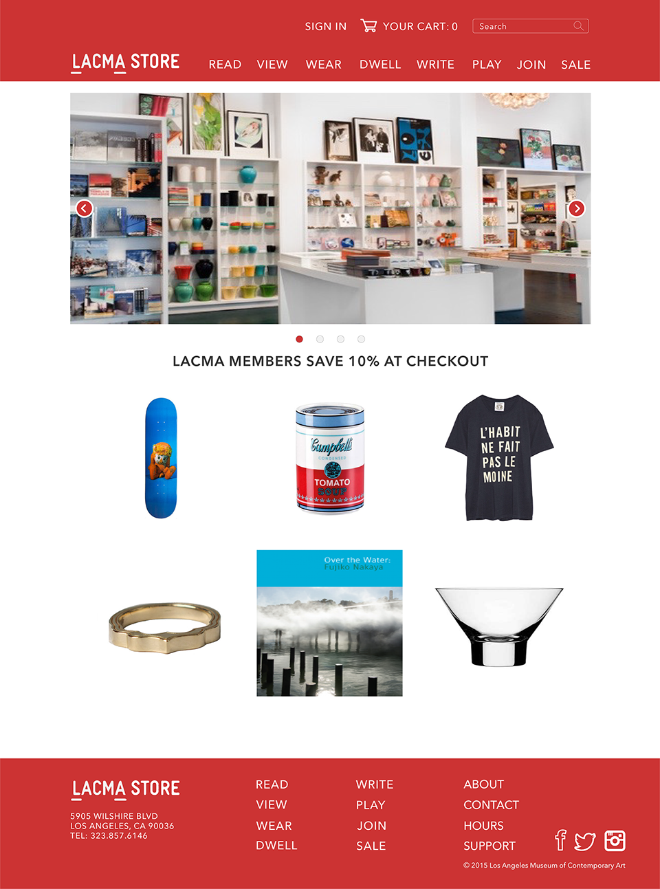
I was going for a simple, clean aesthetic that made good use of the photographic assets to entice and delight users. I was thinking of the visuals in terms of serving both the user and the business goal. However, nice visual design is really just icing on the UX cake.
CHECKOUT PROCEDURE
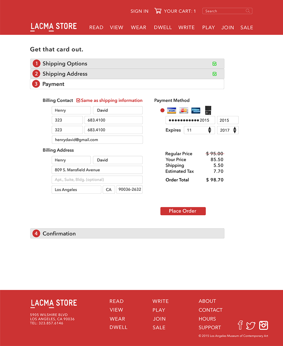
Anyway you look at it, the checkout procedure demands a lot from new users. Thoughtful designers are obligated to create a painless, efficient process. Nothing is more disappointing and frustrating than a poorly designed checkout procedure.
Apple's terrific solution to this challenge is to condense the entire process into a one-page, do-all, accordion style design. The real genius of the accordion design is that it sets users' expectations and it breaks down the entire process into a series of satisfying, assuring, and easily accessible steps.
NEXT STEPS
Perhaps there are ways to streamline the user flow by combining some of the information together...
Testing and feedback as to whether users feel some of the 'humanistic language' is perhaps too cute...
DOCUMENTATION
Starting at Square One
WEAPONS OF CHOICE


