SUMMARY
"One of the reasons people prefer us, and will prefer us in the future, is just the fact that we are social. You get more value out of sharing with friends."
Iqram Magdon-Ismail
Co-Founder
Venmo is a groundbreaking application that allows users to efficiently send payments to others and it has played an enormous role in the explosive growth of the peer to peer payments market. In the third quarter of 2014, Venmo processed $700 million of payments between users.
The social aspect of Venmo allows users to share their P2P transactions with their friends, or publicly with the Venmo community at large, or keep the transaction strictly peer to peer. Beyond its convenience, it's this social aspect that really makes this application so popular.
For this project, Venmo wanted to strengthen their brand by offering a new option for social impact, specifically a charitable giving feature.
CONSIDERATIONS
How can I leverage the social aspect of Venmo to encourage user giving?
CHALLENGES
Our user research strongly indicated that Millennial users do not prefer to donate to causes through social media platforms. For example, according to the Millennial Impact Report, fewer than 10% of respondents said they had ever used Facebook to make donations to charity.
HYPOTHESIS
Millennial users do not donate to charity through social media platforms because they have not yet found the right tool which supports and encourages charitable giving.
PROCESS & SOLUTIONS
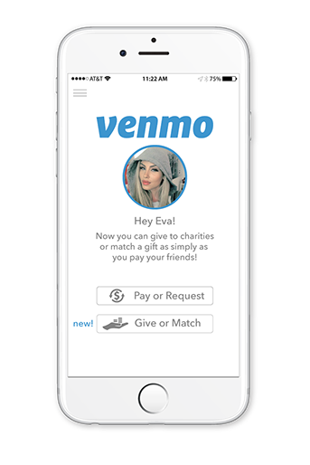
A new home screen design services a number of user-driven needs.
Behavioral observation revealed that new users of the application struggled to find 'home' in the existing iteration.
A personalized welcome in age appropriate language announces and informs users of the new charitable giving feature.
The home screen also establishes a starting point for two distinct user paths for the new iteration of the app: pay/request payment (as before) and the new 'give or match giving' feature.
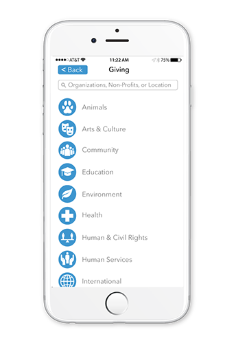
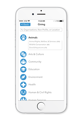
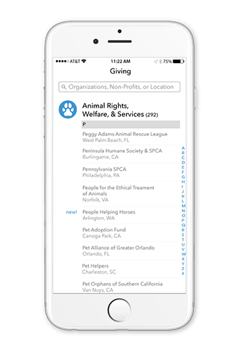
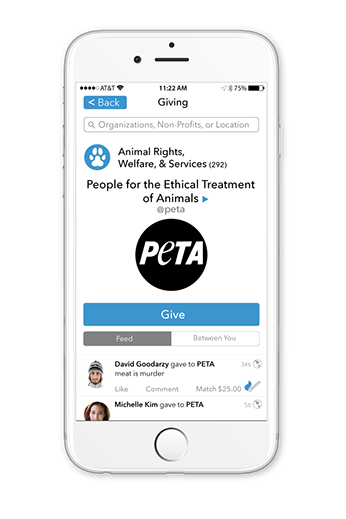
SEARCH OR BROWSE NAVIGATION
User expectations were a high priority. I wanted a design that looks, feels, and just plain works like the Venmo that users know and love. A simple hierarchical design that allows users to browse and find the causes they care about, yet seamlessly fits the existing architecture was what I was after.
Go with the flow! Top to bottom, left to right
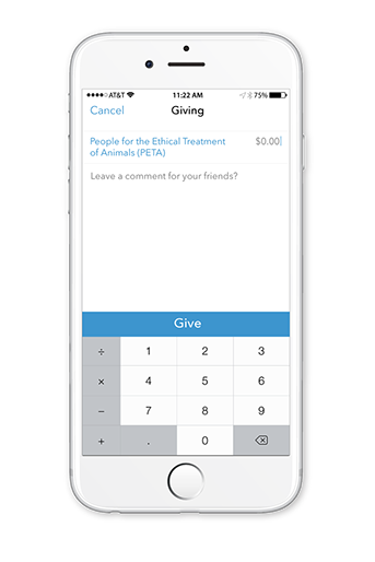
MATCH GIVING FEATURE*
User testing results will ultimately prove the viability of my design, but I can't help but get excited when I think about the potential impact this may have upon application based charitable giving. Given that peer influence plays such an important role in motivating Millennials to action, it is my hope that this feature might generate just such an impulse. In opposition to the traditional, hierarchical search and browse design where one might 'lose the moment', the match giving feature allows users to quickly match and share in the experience of giving in just a few simple clicks. Fingers crossed!
*patent pending.
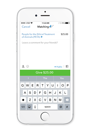
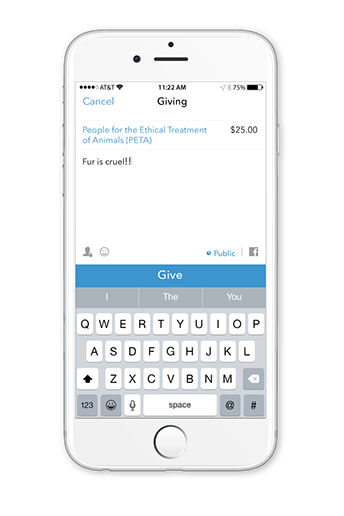
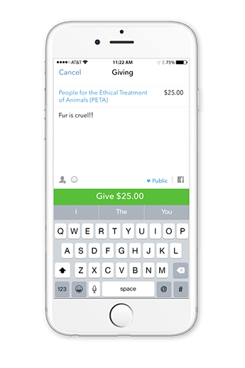
Jane Doe taps 'match' to match her friend Eva's gift
Jane can comment and tap 'Give $25.00'
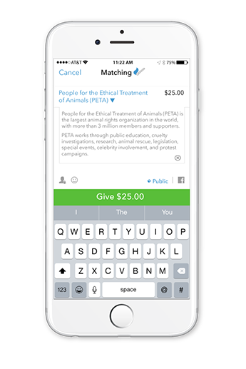
Jane can also read the mission statement for the charity before giving
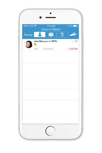
Jane receives confirmation of her gift which she can share with friends
TWEAKS
In this new iteration, I couldn't help myself and used the opportunity to suggest a couple of small but worthwhile improvements to the application as well.
The existing 'pay/request payment' icon is confusing to users in that many do not realize that the application also allows users to request payments from others. This is an important feature, indeed. It is also difficult for users to actually see the icon. Granted, it's a bit of a challenge to get the symbols just right, but I feel that the new icon might better communicate 'pay and request payment' to the user.
I was also compelled to rearrange the transaction history bar. Because Western users read left to right, we have been unconsciously conditioned to go to the upper, left-hand corner, first. Shouldn't the user's personal transaction history be there rather than the far less viewed public transaction history? I think so.
Before & After
NEXT STEPS
Testing. And more testing of my hypothesis.
Whatever the results, it will be an enormous learning experience and a great opportunity to 'share the wealth' with the UX community.
DOCUMENTATION
THE MILLENNIAL IMPACT PROJECT
Great research.
Highly recommended.
The Millennial Impact Project is the most comprehensive and trusted study of the Millennial generation (born 1980-2000) and their involvement with causes. Since beginning the study in 2009, Achieve continues to lead the national research team in partnership with the Case Foundation. With more than 25,000 participants in our studies, The Millennial Impact Project has helped organizations, corporations and individuals everywhere understand the best approaches to cultivate interest and involvement with this generation.
www.themillennialimpact.com

WEAPONS OF CHOICE

